

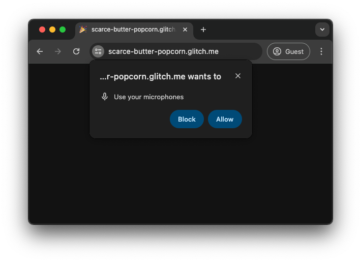
There are a number of imperative methods for asking for permission to use
powerful features like location access in web apps. These methods come with a
number of challenges, which is why the Chrome permissions team is experimenting
with a new declarative method: a dedicated HTML
element is in origin trial from Chrome 126, and ultimately we hope to
standardize it.
Imperative methods for requesting permission
When web apps need access to
powerful features, they
need to ask for permission. For example, when
Google Maps requires the user’s location using the
Geolocation API,
browsers will prompt the user, often with the option to store that decision.
This is a
well defined concept
in the Permissions specification.
Implicitly ask on first use versus explicitly request upfront
The Geolocation API is a powerful API and relies on the implicitly ask on first
use approach. For example, when an app calls the
navigator.geolocation.getCurrentPosition()
method, the permissions prompt automatically pops up upon the first call.
Another example is
navigator.mediaDevices.getUserMedia().
Other APIs, like the
Notification API or
the
Device Orientation and Motion API,
commonly have an explicit way to request permission through a static method like
Notification.requestPermission()
or
DeviceMotionEvent.requestPermission().
Challenges with imperative methods for asking for permission
Permission spam
In the past, websites could call methods like
navigator.mediaDevices.getUserMedia() or Notification.requestPermission(),
but also navigator.geolocation.getCurrentPosition() immediately when a website
was loaded. A permission prompt would pop up before the user had interacted with
the website. This is sometimes described as permission spam and affects both
approaches, implicitly asking on first use as well as explicitly requesting
upfront.
Browser mitigations and user gesture requirement
Permission spam led to browser vendors requiring a user gesture like a button
click or a keydown event before showing a permission prompt. The problem with
this approach is that it’s very difficult, if not impossible, for the browser to
figure out if a given user gesture should result in a permission prompt to be
shown or not. Maybe the user was just clicking on the page in frustration
anywhere because the page took so long to load, or maybe they were indeed
clicking on the Locate me button. Some websites also became very good at
tricking users into clicking on content to trigger the prompt.
Another mitigation is adding prompt abuse mitigations, like completely blocking
features to begin with, or to showing the permission prompt in a non-modal, less
intrusive manner.
Permission contextualization
Another challenge, especially on big screens, is the way the permission prompt
gets commonly displayed: above the
line of death, that
is, outside of the area of the browser window that the app can draw onto. It’s
not unheard of that users would miss the prompt at the top of their browser
window when they just clicked a button at the bottom of the window. This problem
is often exacerbated when browser spam mitigations are in place.

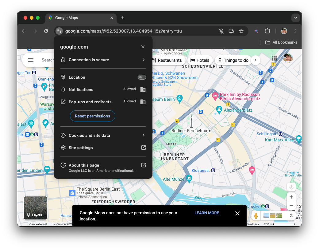
No easy undo
Finally, it is too easy for users to navigate themselves into a dead-end. For
example, once the user has blocked access to a feature, it requires them to be
aware of the site information drop-down where they can either Reset
permissions or toggle blocked permissions back on. Both options in the worst
case require a full reload of the page until the updated setting takes effect.
Sites have no ability to provide an easy shortcut for users to change an
existing permission state and have to painstakingly explain to users how to
change their settings as shown at the bottom of the following Google Maps
screenshot.
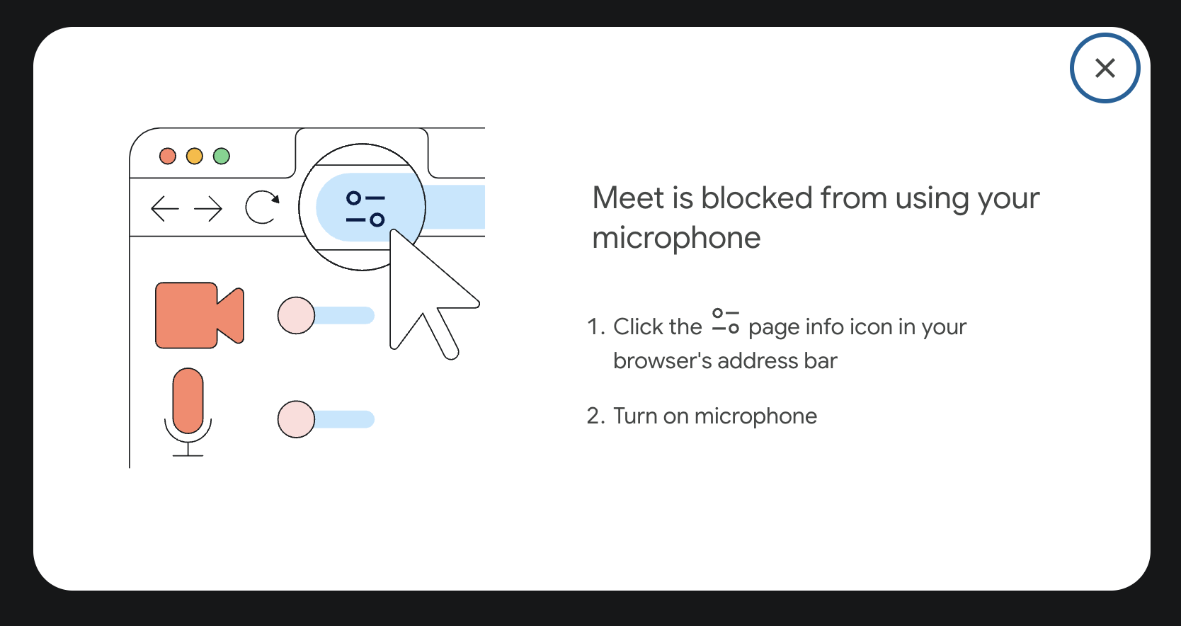
If the permission is key to the experience, for example, microphone access for a
video conferencing application, apps like Google Meet show intrusive dialogs
that instruct the user how to unblock the permission.
A declarative
To address the challenges described in this post, the Chrome permissions team
have launched an origin trial for a new HTML element,
element lets developers declaratively ask for permission to use, for now, a
subset of the powerful features available to websites. In its simplest form, you
use it as in the following example:
It’s still being actively debated
whether
element or not. A void element is a self-closing element in HTML that cannot
have any child nodes, which, in HTML, means it may not have an end tag.
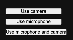
The type attribute
The
type
attribute contains a space-separated list of permissions you are requesting. At
the time of this writing, the allowed values are 'camera', 'microphone', and
camera microphone (separated by space). This element by default renders
similar to buttons with barebones user agent styling.
The type-ext attribute
For some permissions that allow for additional parameters, the
type-ext
attribute accepts space-separated key-value pairs, like, for example,
precise:true for the geolocation permission.
The lang attribute
The button text is provided by the browser and meant to be consistent, so it
cannot be directly customized. The browser changes the language of the text
based on the inherited language of the document or the parent element chain, or
an optional
lang
attribute. This means that developers don’t need to localize the
element themselves. If the
trial stage, several strings or icons may be supported for each permission type
to increase the flexibility. If you’re interested in using the
element and need a specific string or icon, get in touch!
Behavior
When the user interacts with the
various stages:
-
If they hadn’t allowed a feature before, they can allow it on every visit, or
allow it for the current visit.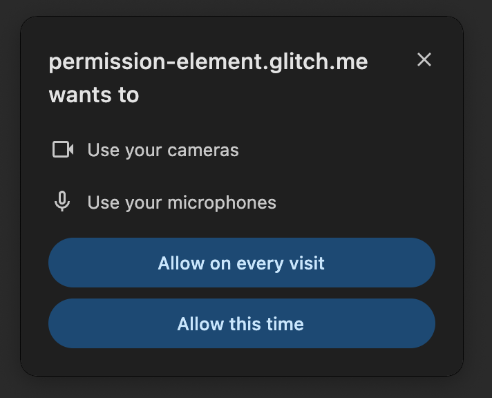
-
If they had allowed the feature before, they can continue allowing it, or stop
allowing it.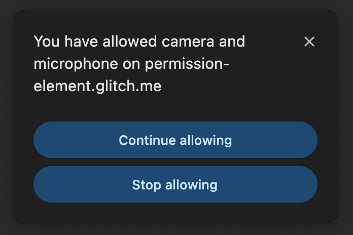
-
If they had disallowed a feature before, they can continue not allowing it, or
allow it this time.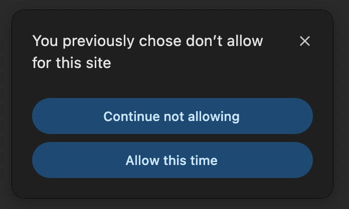
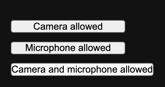
The text of the
status. For example, if permission was granted to use a feature, the text
changes to say the feature is allowed. If permission first needs to be granted,
the text changes to invite the user to use the feature. Compare the earlier
screenshot with the following screenshot to see the two states.
CSS design
To ensure users can easily recognize the button as a surface to access powerful
capabilities, the
restrictions don’t work for your use case, we’d love to hear about
how and why! While not all styling needs can be accommodated, we are hoping to
discover safe ways to allow more styling of the
origin trial. The following table details some properties that have restrictions
or special rules applied to them. In case any of the rules are violated, the
attempts to interact with it will result in exceptions that can be caught with
JavaScript. The error message will contain more details on the detected
violation.
| Property | Rules |
|---|---|
|
|
Can be used to set the text and background color, respectively. The contrast between the two colors needs to be sufficient for clearly legible text (contrast ratio of at least 3). The alpha channel has to be 1. |
|
|
Must be set within the equivalent of small andxxxlarge. The element will be disabled otherwise. Zoomwill be taken into account when computing font-size. |
|
|
Negative values will be corrected to 0. |
margin (all) |
Negative values will be corrected to 0. |
|
|
Values under 200 will be corrected to 200. |
|
|
Values other than normal and italic will becorrected to normal. |
|
|
Values over 0.5em will be corrected to0.5em. Values under 0 will be corrected to0. |
|
|
Values other than inline-block and nonewill be corrected to inline-block. |
|
|
Values over 0.2em will be corrected to0.2em. Values under -0.05em will becorrected to -0.05em. |
|
|
Will have a default value of 1em. If provided, themaximum computed value between the default and the provided values will be considered. |
|
|
Will have a default value of 3em. If provided, theminimum computed value between the default and the provided values will be considered. |
|
|
Will have a default value of fit-content. If provided,the maximum computed value between the default and the provided values will be considered. |
|
|
Will have a default value of three times fit-content. Ifprovided, the minimum computed value between the default and the provided values will be considered. |
|
|
Will only take effect if height is set toauto. In this case, values over 1em will becorrected to 1em and padding-bottom will beset to the value of padding-top. |
|
|
Will only take effect if width is set toauto. In this case, values over 5em will becorrected to 5em and padding-right will beset to the value of padding-left. |
|
|
Distorting visual effects won’t be allowed. For now, we only accept 2D translation and proportional up-scaling. |
The following CSS properties can be used as normal:
font-kerningfont-optical-sizingfont-stretchfont-synthesis-weightfont-synthesis-stylefont-synthesis-small-capsfont-feature-settingsforced-color-adjusttext-renderingalign-selfanchor-name aspect-ratioborder(and allborder-*properties)clearcolor-schemecontaincontain-intrinsic-widthcontain-intrinsic-heightcontainer-namecontainer-typecounter-*flex-*floatheightisolationjustify-selfleftorderorphansoutline-*(with the exception noted before foroutline-offset)overflow-anchoroverscroll-behavior-*pagepositionposition-anchorcontent-visibilityrightscroll-margin-*scroll-padding-*text-spacing-trimtopvisibilityxyruby-positionuser-selectwidthwill-changez-index
Additionally, all logically equivalent properties can be used (for example,
inline-size is equivalent to width), following the same rules as their
equivalent.
Pseudo-classes
There are two special pseudo-classes that allow for styling the
element based on the state:
:granted: The:grantedpseudo-class allows for special styling when a
permission was granted.:invalid: The:invalidpseudo-class allows for special styling when the
element is in an invalid state, for example, when it is served in a
cross-origin iframe.
permission {
  background-color: green;
}

permission:granted {
  background-color: light-green;
}

/* Not supported during the origin trial. */
permission:invalid {
  background-color: gray;
}
JavaScript events
The
Permissions API.
There are a number of events that can be listened for:
-
onpromptdismiss: This event is fired when the permission prompt triggered by
the element has been dismissed by the user (for example by clicking the close
button or clicking outside the prompt). -
onpromptaction: This event is fired when the permission prompt triggered by
the element has been resolved by the user taking some action on the prompt
itself. This doesn’t necessarily mean the permission state has changed, the
user might have taken an action that maintains the status quo (such as
continuing to allow a permission). -
onvalidationstatuschange: This event is fired when the element switches from
being"valid"to"invalid". The element is considered"valid"when the
browser trusts the integrity of the signal if the user were to click it, and
"invalid"otherwise, for example, when the element is partly occluded by
other HTML content.
You can register event listeners for these events directly inline in the HTML
code
(
or using addEventListener() on the
following example.
Feature detection
If a browser doesn’t support an HTML element, it won’t show it. This means that
if you have the
browser doesn’t know it. You may still want to detect support using JavaScript,
for example, to create a permission prompt triggered through a click of a
regular .
if ('HTMLPermissionElement' in window) {
  // The `` element is supported.
}
Origin trial
To try the
sign up for the origin trial.
Read Get started with origin trials for
instructions on how to prepare your site to use origin trials. The origin trial
will run from Chrome 126 to 131 (February 19, 2025).
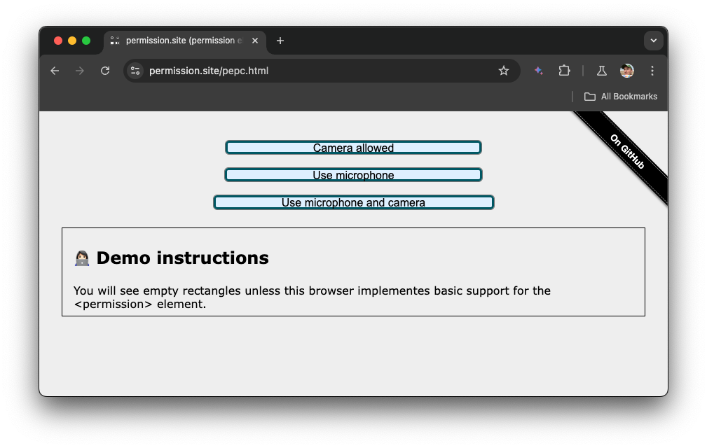
Demo
Explore the demo and check out the source code on GitHub. Here’s a screenshot of the experience on a supporting browser.
Feedback
We would love to hear from you how
free to respond to one of the
Issues in the repository, or file a new
one. Public signals in the repo for the
it.
FAQ
- How is this better than a regular
paired with the Permissions
API? A click of ais a user gesture, but browsers have no way of
verifying that it’s connected to the request for asking for permission. If the
user has clicked a
related to a permission request. This allows the browser to facilitate flows
that otherwise would be a lot more risky. For example, allowing the user to
easily undo the blocking of a permission. - What if other browsers don’t support the
non-supporting browsers, a classic permission flow can be used. For example,
based on the click of a regular. The permissions team are also
working on a polyfill. Star the GitHub repo
to be notified when it’s ready. - Was this discussed with other browser vendors? The
was actively discussed at W3C TPAC in 2023 in a
breakout session. You
can read the
public session notes.
The Chrome team has also asked for formal Standards Positions from both
vendors, see the Related links section. The
element is an ongoing topic of discussions with other browsers and we’re
hoping to standardize it. - Should this actually be a void element? It’s still being
actively debated
whether
element or not. If you have feedback, chime in on the Issue.
Acknowledgements
This document was reviewed by
Balázs Engedy,
Thomas Nguyen,
Penelope McLachlan,
Marian Harbach,
David Warren, and
Rachel Andrew.
