

You might have heard recently that Safari Technology Preview 234 landed the final plan for supporting masonry-style layouts in CSS. It’s called Grid Lanes.
CSS Grid Lanes adds a whole new capability to CSS Grid. It lets you line up content in either columns or rows — and not both.
This layout pattern allows content of various aspect ratios to pack together. No longer do you need to truncate content artificially to make it fit. Plus, the content that’s earlier in the HTML gets grouped together towards the start of the container. If new items get lazy loaded, they appear at the end without reshuffling what’s already on screen.
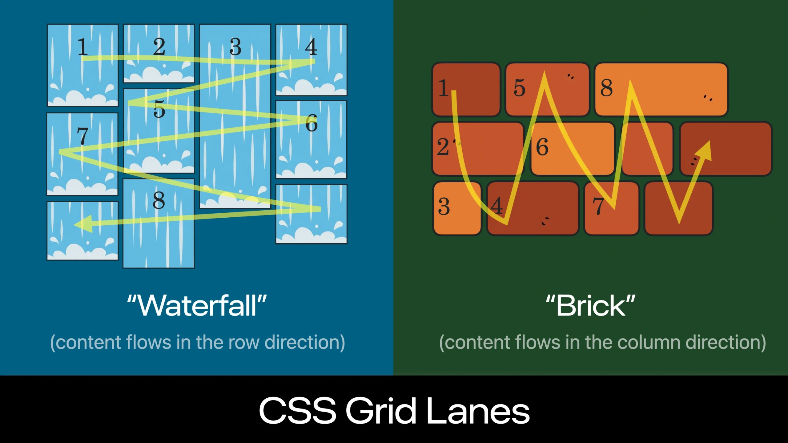
It can be tricky to understand the content flow pattern as you are learning Grid Lanes. The content is not flowing down the first column to the very bottom of the container, and then back up to the top of the second column. (If you want that pattern, use CSS Multicolumn or Flexbox.)
With Grid Lanes, the content flows perpendicular to the layout shape you created. When you define columns, the content flows back and forth across those columns, just like to how it would if rows existed. If you define rows, the content will flow up and down through the rows — in the column direction, as if columns were there.
Having a way to see the order of items can make it easier to understand this content flow. Introducing the CSS Grid Lanes Inspector in Safari. It’s just the regular Grid Inspector, now with more features.
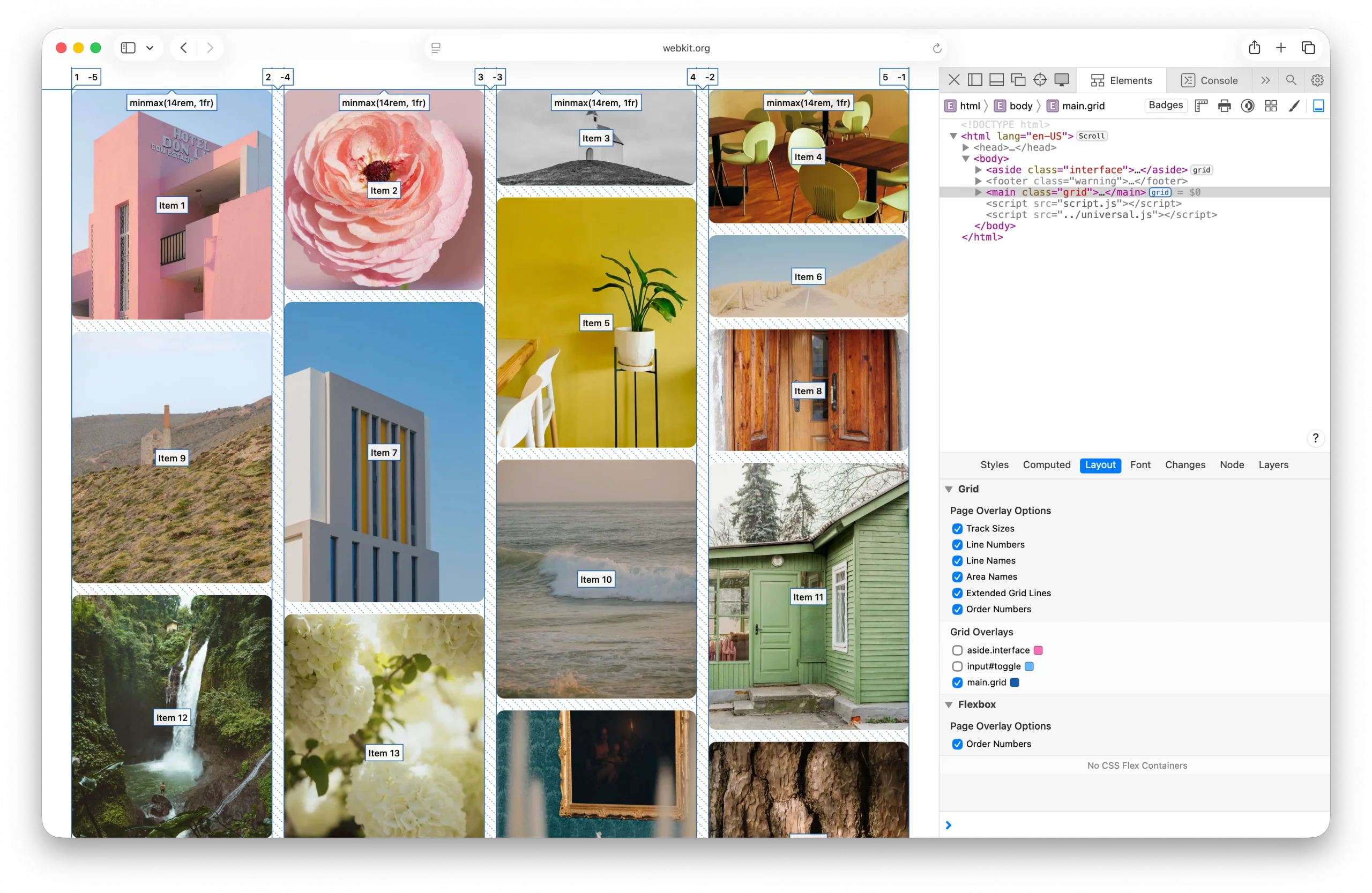
Safari’s Grid Inspector already reveals the grid lines for Grid Lanes, and labels track sizes, line numbers, line names, and area names. Now it has a new feature — “Order Numbers”.
By turning on the order numbers in the example above, we can clearly see how Item 1, 2, 3, and 4 flow across the columns, as if there were a row. Then Item 5 is in the middle right, followed by Item 6 on the far right, and so on.
You might be tempted to believe the content order doesn’t matter. With pages like this photo gallery — most users will have no idea how the photos are ordered in the HTML. But for many users, the content order has a big impact on their experience. You should always consider what it’s like to tab through content — watching one item after another sequentially come into focus. Consider what it’s like to listen to the site through a screenreader while navigating by touch or keyboard. With Grid Lanes, you can adjust flow-tolerance to reduce the jumping around and put items where people expect.
To know which value for flow tolerance to choose, it really helps to quickly see the order of items. That makes it immediately clear how your CSS impacts the result.
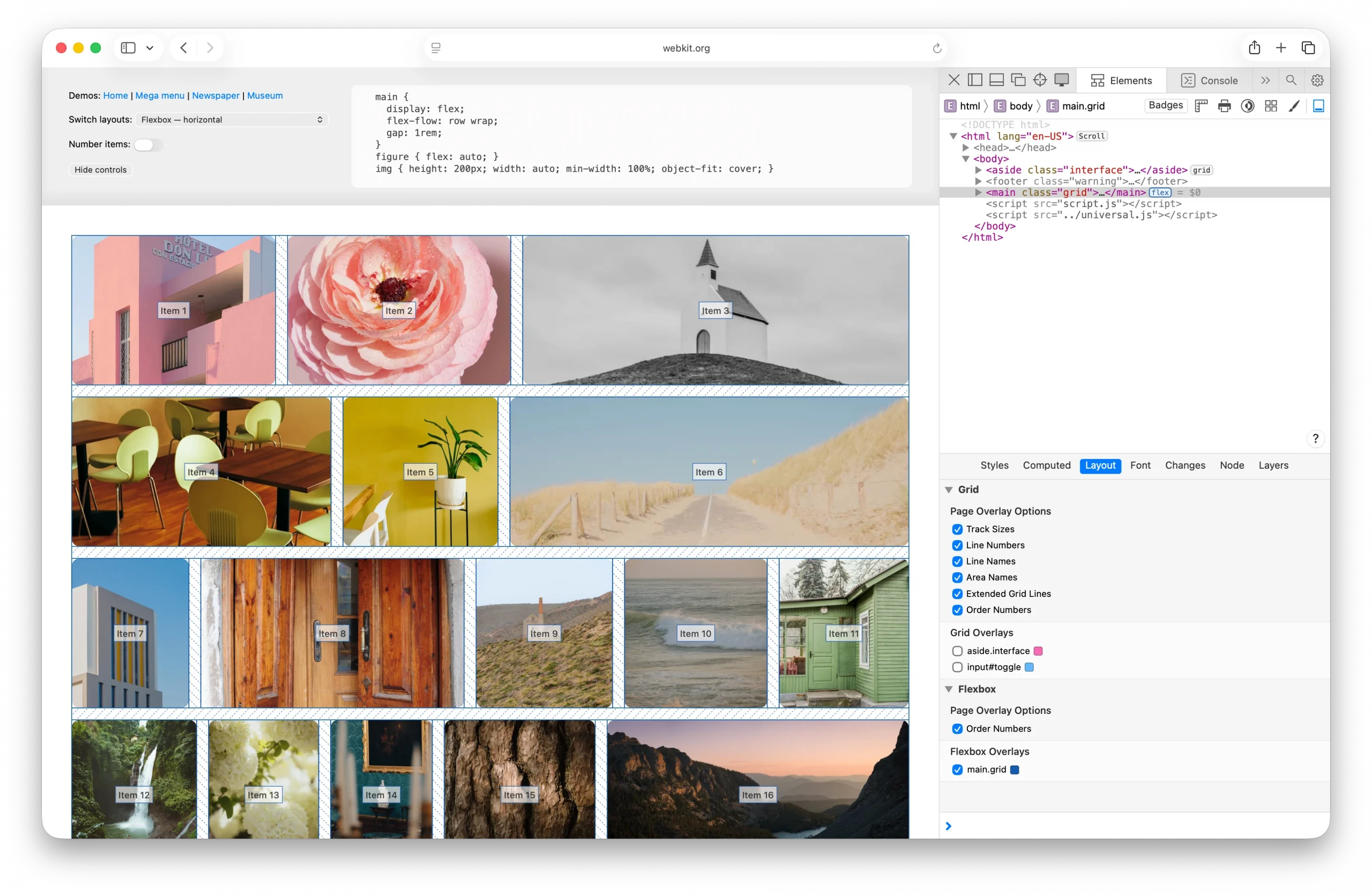
Order Numbers in the Grid Inspector is an extension of a feature Safari’s Flexbox Inspector has had since Safari 16.0 — marking the order of Flex items. Seeing content order is also helpful when using the order property in Flexbox.
Order Numbers in Safari’s Grid Inspector works for CSS Grid and Subgrid, as well as Grid Lanes.
Try out Safari’s layout tooling
The Grid and Flexbox layout inspectors might seem similar across browsers, but the team behind Safari’s Web Inspector has taken the time to finely polish the details. In both the Grid and Flexbox Inspectors, you can simultaneously activate as many overlays as you want. No limits. And no janky scrolling due to performance struggles.
Safari’s Flexbox Inspector visually distinguishes between excess free space and Flex gaps, since knowing which is which can solve confusion. It shows the boundaries of items, revealing how they are distributed both on the main axis and the cross axis of Flexbox containers. And it lists all the Flexbox containers, making it easier to understand what’s happening overall.
Our Grid Inspector has a simple and clear interface, making it easy to understand the options. It also lists all Grid containers. And of course, you can change the default colors of the overlays, to best contrast with your site content.
And Safari’s Grid and Flexbox Inspectors are the only browser devtools that label content order. We hope seeing the order of content in Grid Lanes helps you understand it more thoroughly and enjoy using this powerful new layout mechanism.
Try out Order Numbers
Order Numbers in Safari’s Grid Inspector shipped today in Safari Technology Preview 235. Let us know what you think. There’s still time to polish the details to make the most helpful tool possible. You can ping Jen Simmons on Bluesky or Mastodon with links, comments and ideas.
